Neue Perspektiven
written by Tim Vogler
Nach dem Beitrag gestern hagelte es Durchhalteparolen. Das erwärmt das Herz, aber es ist nicht notwendig. Auch die Fragen danach, ob ich noch genug Energie dafür habe, die Bücher zum Erfolg zu führen, sind gut gemeint und nett, aber natürlich habe ich die. Manchmal kann man nicht verhehlen, dass die Karosse einige Dellen hat, aber nur um sie auszubeulen und dann die Rallye noch schnittiger anzugehen.
Als Beispiel dafür, dass es vorangeht, hier der erste Sketch meiner neuen Illustratorin Hye-Jin Won. Sie werde ich später vorstellen, einstweilen soll ihre Kunst für sie sprechen.
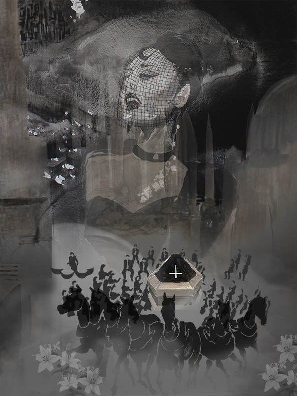
Grablegungsprozession für Kanzler Söderberg
Das Bild ist nur ein Ideensketch, aber er gefällt mir sehr. Ich hoffe, ihr mögt es auch. Wie mit Cosimo wird sie mithilfe meiner Anregungen daraus das nun das fertige Bild formen. Und um zu zeigen, dass ich noch genug Energie für Metropolis habe, poste ich heute mal die gesamten Anregungen, die ich ihr mitgegeben habe (in authentischer »im-Eifer-des-Gefechts-Stilistik und -Rechtschreibung nebst bewährtem denglischen Duktus 😉 ). Dann könnt ihr euch schon mal vorzustellen versuchen, was aus dem Bild werden könnte…
– I really like how you put different dimensions or „layer“ in this. The columns behind the projection of the Diva, the stairs to the left. The miniature on top left, the lilies and the horses. You do it just right with focusing on some foreground elements like the horses and the coffin, the Diva…(characters) And have some background pieces, that show the world and explain the scene (environment).
So I´m even more sure than before, that you´re the right one. I also think, it´s good to learn from Cosimo and do it a little like he did in the composition of the pics. This multi-dimension thing for example. He did it good and it worked. And so we might have a certain Metropolis-Style now, in which the paintings are composed. Some things are kind of corporate that way, but the details and the whole thing how you fill this with your style is you and it´s just you. And the great thing is, it really works. I showed it to my girlfriend and she got reminded on Cosimo immediately and then she saw it was something really different and was really delighted by your style. The new approach. That`s what we should go for. It´s not about creating the new Cosimo, but the people in a way expect paintings like in part 1. So in the first second they should look similar, but than the readers see that they´re completely different.
– To give the readers the best illustrations they would wish for it´s important, to choose the „right“ elements. I like that you show the inside of the hall, the columns and everything. And the composition with the lady and the columns definitely works. But I had this with Cosimo. It´s probably impossible to show inside and outside of the hall at the same time. And in this scene the outside is the more important part. The setting is this: We are at the most impressive part of Berlin. The old Berliner Dom and the old Museums on the one side. The gigantic hall with the large cupula, his column portal, the big stairs with lion statues at the sides etc. Big glas buildings behind the old ones near spree. This is the heart of the modern Berlin, it´s his past and present and the big, wide avenue is the vein that floats through it.
The Avenue is empty now. Spectators on stages at the side, lilies all over, people waving flags, but everybody waiting for the coffin of the big dead man. In this case it even feels like the city is standing still. The buildings are also watching and mourning, kind of. The man in the coffin ist the one that reshaped or created the city. It´s a surreal authors view, that I have in mind, but it kind of pulls the expectations of the pople in the composition. Everybody is with Söderberg on his last road to eternal peace and glory. (Of course he was a corrupt bastard and a bad man addicted to power, but that´s not in the picture right now. It´s in the mightiness of the buildings. The greatness of the city, that he forces to be silent and watch him enter the grave.)
That´s the main reason why I would need the city in this picture. Not just because this one would be the picture that gives the readers an impression of the modern part of the Metropolis-City (that´s the practical point of view and we have it mind, but we let us guide by other perspectives and approaches). I need it because it´s showing the old chancellor´s power, that works in a way even better now he´s deceased. He forces everybody to stand still and watch him. Buildings, people, flowers, even the grey sky. All is just a setting for his last monumental performance. The world is standing still because he created it, he was the world and now he is for the last time.
This is also important, because this german state is still a democracy, but in a way just on paper. After the Grosse Katastrophe everybody accepted that you can´t chose anymore. If everybody lives like he would wish, the world would go to hell. And the disaster is not over now. The ecological system with weather and pollution etc is still out of balance and will stay like that. Everything is unpredictable and the people with power used it for their own agenda. They created a system in which the bigger picture (saving the world and the nation) always dominates the wishes of the individuals. Everything is in control. Power and violence are everywhere, at least the thread to use it. This is one important element of the picture and it´s in the silence. In the greatness and the mightiness of a modern city, that provides all freedom elements and is now standing still to guide the big dominator to the grave.
– This being said does not mean big things. It´s still about the procession and the singer and the coffin. but I think it has to be surrounded by the city. We need to show that it happens in the heart of it. At one mighty place. So that the readers are also like the spectators. They are standing still to watch it. And no matter what elements we use for the environment- collage, they need a clear and immediate impression of the core scene and the spectacle. (And actually yours are absolutely fine, we can keep it in that style.)
– So probably you can work with al the elements. Horses, Coffin and lady and move it a little in the background to make room for the city. The city does not need to be all over. You can use the sides for the fine collage elements. I like them. They make it a painting and an art piece. That´s the way. We just need a little more clarity and mightiness in the middle part. We need to see the Avenue and the coffin with the horses and the small (real) lady in the platform and the big projection „flying“ over her. (She is also a criminal, so the projection shows her big twisted ego, although right now, at this stage of the story, everybody just watches her as the shining star of Berlin opera. As a sensitive lady mourning for a friend while singing for him.)
– Because we need clarity I would´t put the musicians like that. Not as »associations«. I would put them as they are there, as an orchestra on a platform or I would´t put them there at all. (It dosen´t matter that much, but:) in the book the diva comes after choir and orchestra, after the Diva comes the chancellors coffin. If you choose this perspecticve and start with the coffin horses, there´s nothing behind the coffin, juts the empty Avenue and the Brandenburger Tor somewhere in the back. And this could be a good perspective because you can always use the projections of the diva and let it fly over or behind the coffin. That´s the sense of it. To let everybody see her face on the tribunes while she sings, even to the diplomates on the tribunes near Brandenburger Tor.
– Again on clarity: Randa immeditately saw that it was about death because if the lilies. That´s great. She did´t see the coffin in the first place. Also because it was surrounded by musicians. It looked kind of like a happy gathering and she didn´t get what they´re doing there. (»Why is someone playing the drums there?«)
– So: Your sketch is great. I like the atmosphere, I like the composition. I like the face and all that and I like how you used the sides. How you put the miniature of the Märkische Viertel in the top part is just awesome. We just need the city and the empty avenue and the tribunes in there and place coffin, horses and Diva in there. I´m not sure if we can keep the columns then. I would like that but maybe it gets too much. (And: Just a thought: Normally the horses would pull the coffin in pairs of two. It would look more strict not like wild horses running. I like the way you painted them, but maybe we get them closer to a funeral like atmosphere if you let them run in pairs. That´s absolutely no must, just a thought for you to reflect on.
– As to black and white: It´s easier to impress viewers with colors, but if we do this black and white, it would probably be better. Many readers shoe the pics in b/w anyways, so we produce the paintings as most people see it. And it´s always a little difficult to have it printed in color. So: You can use colors, everything is possible, but if you go for a b/w concept and make it work, it would make technical and distributional aspects easier. And you can definitely do it b/w. Your painting is strong and it has class. You can see the old times through it and the dystopia is in the Märkische Viertel and all that. We get it in also easily. It´s already there.
Neueste Kommentare